Search
When?
-
Moving from the Sciences to the Arts
13 December 2023 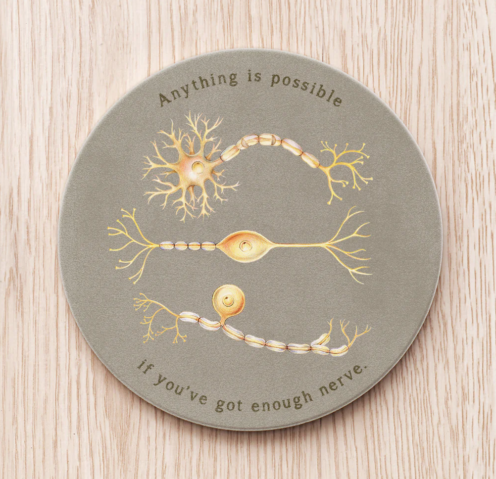
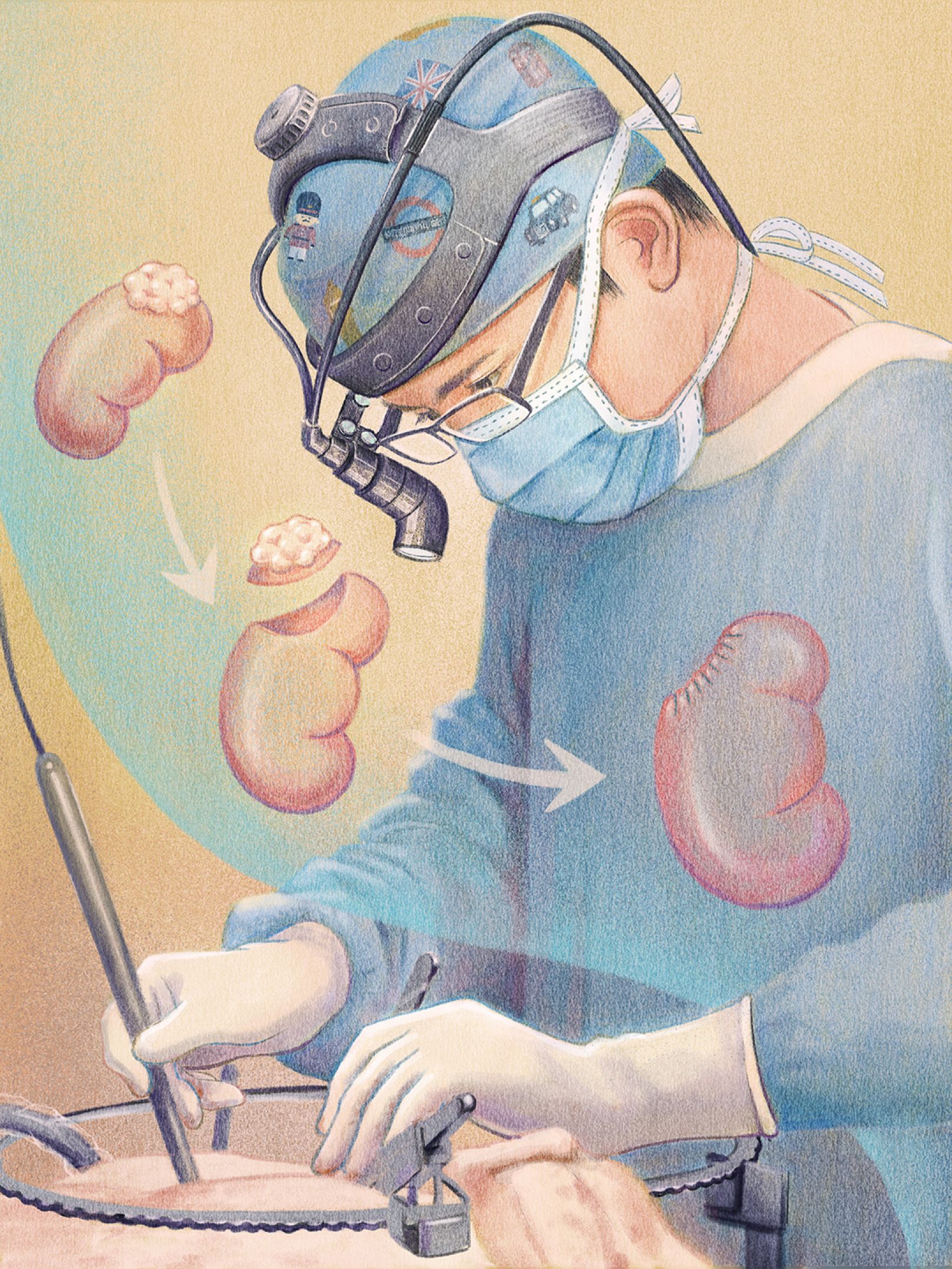
It’s always interesting for me to learn about others who have moved from the Sciences to the Arts, so it was great when Taiwanese illustrator Emma Cheng appeared on one of my design news sites this week. I find her style, and use of pencil crayons, quite unique. She describes her work as “a drama series called Health, in which warmth, quirkiness, and whimsicality play together.”
Emma spent years of working as an MD and an illustrator, illustration being something that she practiced in her spare time. Eventually she felt, “I was in a place where both sides needed me to invest more effort in order to break through. It's like dating two people again and again. You'll have to decide at some point.” When she had to move to the US for her husband’s work, she took the opportunity to wholeheartedly pursue illustration.
It was when I finally had to really to commit to medical school that I decided to go to art school instead. While studying for my neuroscience degree, I had always studied art as well, so I had built up enough work to put together a portfolio to apply. I always thought I could go to medical school if things didn’t work out. Well, things have come full circle, and I have founded MOTHandRUST, where we do a lot of work for science organisations.
Emma is often asked how something as unrelated as science can inform her art. She says it perfectly when she conveys one of the challenges of moving from the Sciences to the Arts: “A challenge I faced was the lack of a clear career plan. As a doctor, there is already a ladder for everyone to climb in the industry. Basically, what you have to do is pass one test after another. You don't have to worry too much about your future in general. However, as a freelance illustrator, you must build the ladder yourself.”
Read the complete article on Creative Boom.
Emma Cheng's site.
-
MOTHandRUST is 13 years old
29 November 2023  MOTHandRUST turned 13 years old on November 4th! As the founder, I can't help but wonder if this coming year will be difficult due to this infamous number... I don't wonder too long however, as I am not a particularly suspicious person.Triskaidekaphobia, the fear of the number 13Historically, much of the western world such as the United States, Canada, Australia, the United Kingdom and Europe has viewed the number 13 as unlucky. Hence, the 13th floor of some buildings are omitted.Tetraphobia, the fear of the number 4China, Taiwan, Singapore, Japan, Korea, and Vietnam, as well as in some other East Asian and South East Asian countries, have traditionally see the number 4 as being the unlucky number. Therefore, it is not uncommon for some buildings here to omit floors with numbers that include the digit 4. Some also omit floor 13 for good measure.Heptadecaphobia fear of the number 17You do you might notice that the elevator goes straight from the 16th to the 18th floor in some buildings in Italy. Indeed, it is the number 17 that is unlucky.Well, our 4th year was a very good one, so perhaps our 13th will be as well. And also our 17th year. Onwards!Posted in: MandR news
 -
The first Merkin Prize in Biomedical Technology has been awarded
8 November 2023 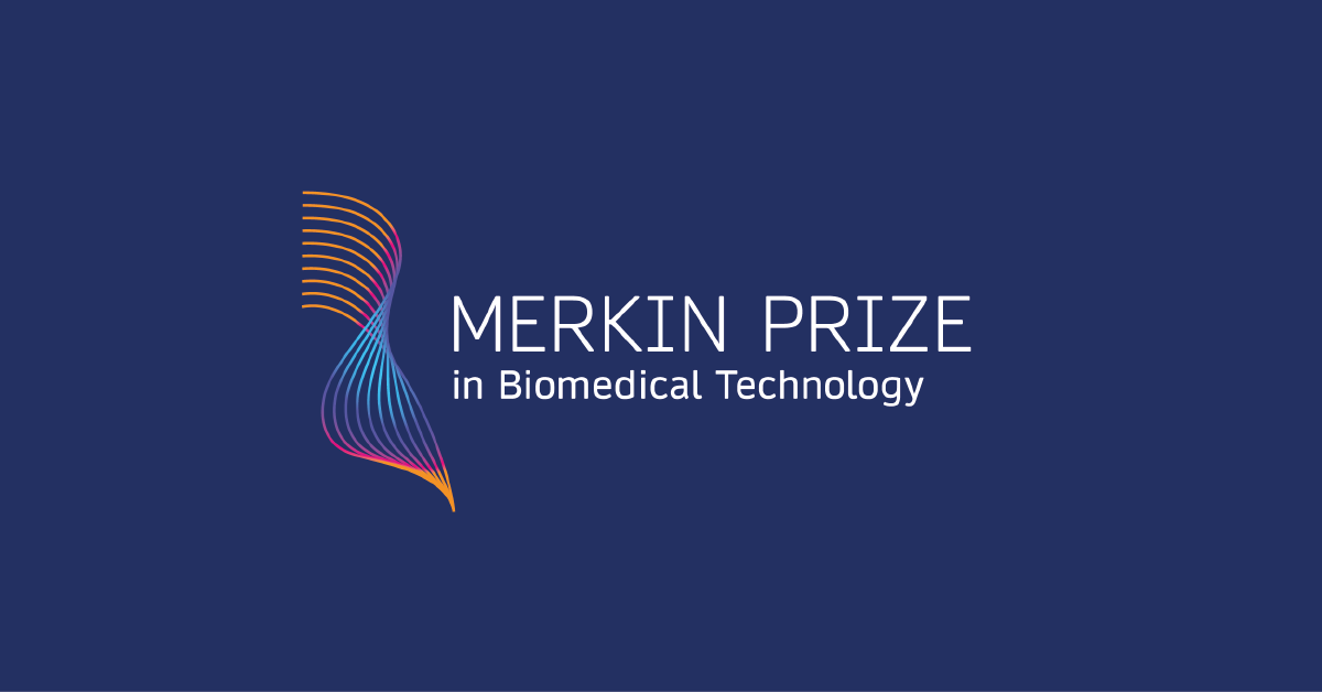
"It's a very high honor for me to have been selected for this prize. The research we're being recognized for, people worldwide in almost every biology and biochemistry laboratory use our chemistry in one way or another," said Dr. Caruthers.This autumn, Dr. Marvin H. Caruthers of the University of Colorado, Boulder, has won the inaugural Richard N. Merkin Prize in Biomedical Technology for developing an efficient, automated technology for synthesizing DNA. The ability to synthesize genetic information has ultimately changed the face of medicine and paved the way for the genetics revolution.The Merkin Prize, created by the Merkin Family Foundation and administered by the Broad Institute of MIT and Harvard, recognizes technologies that have improved human health, and carries a $400,000 cash award. Nominations from around the globe were evaluated by a selection committee composed of eight scientific leaders from academia and industry in the US and Europe, as well as jury chair Dr. Harold Varmus, Nobel laureate."Dr. Caruthers' work demonstrates the type of technology used in the life sciences that impacts patients' care and has significantly advanced healthcare for millions, the purpose of the prizes," said Dr. Richard Merkin, President and CEO of Heritage Provider Network, one of the country’s largest physician founded and physician owned integrated healthcare systems.The logo and branding for this prize was proudly developed by MOTHandRUST.Nominations for the 2024 Merkin Prize will open in September 2023. Visit merkinprize.org for more information.Posted in: science MandR work -
#FlashbackFriday: Communicating 15 years of science
20 October 2023 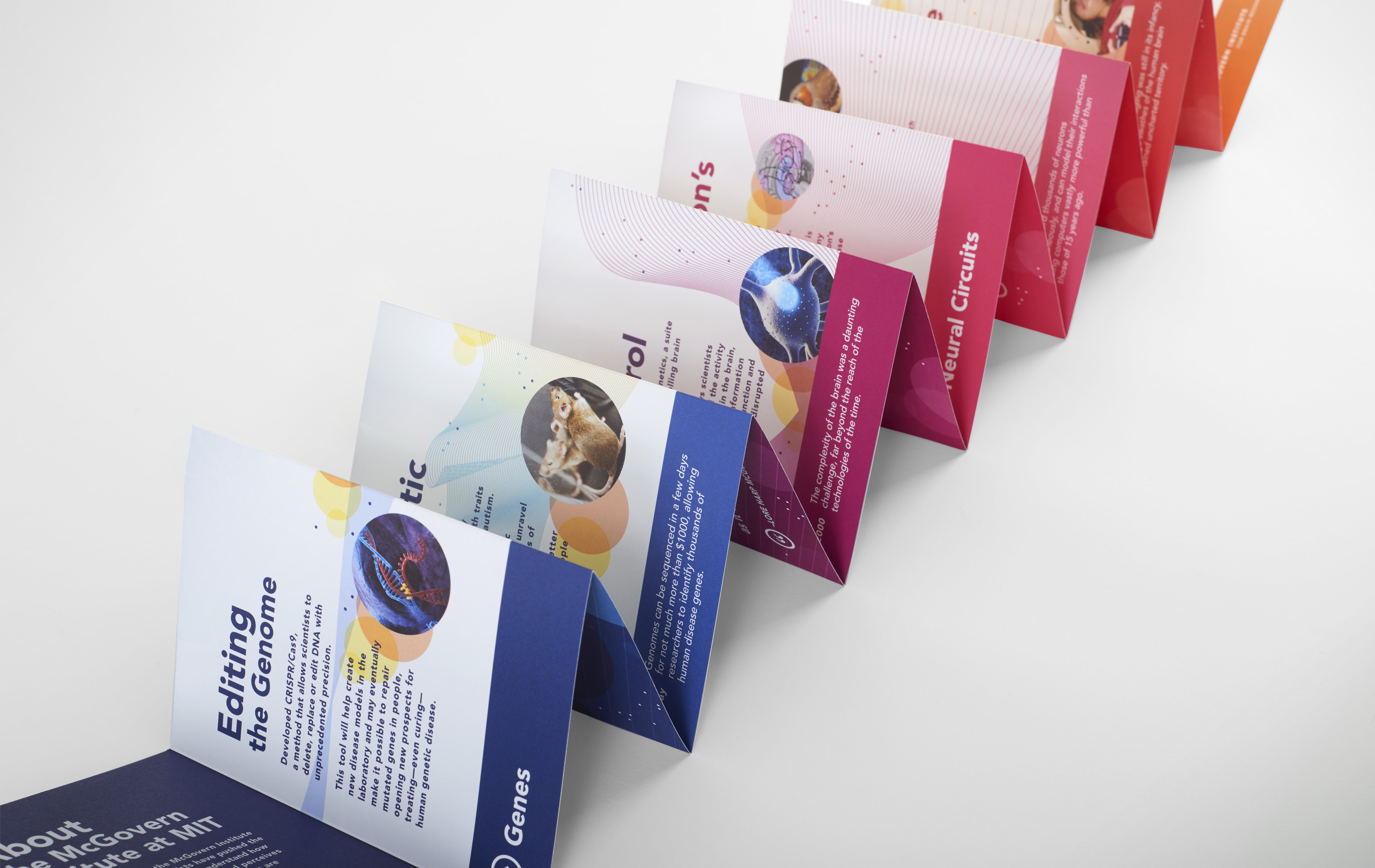
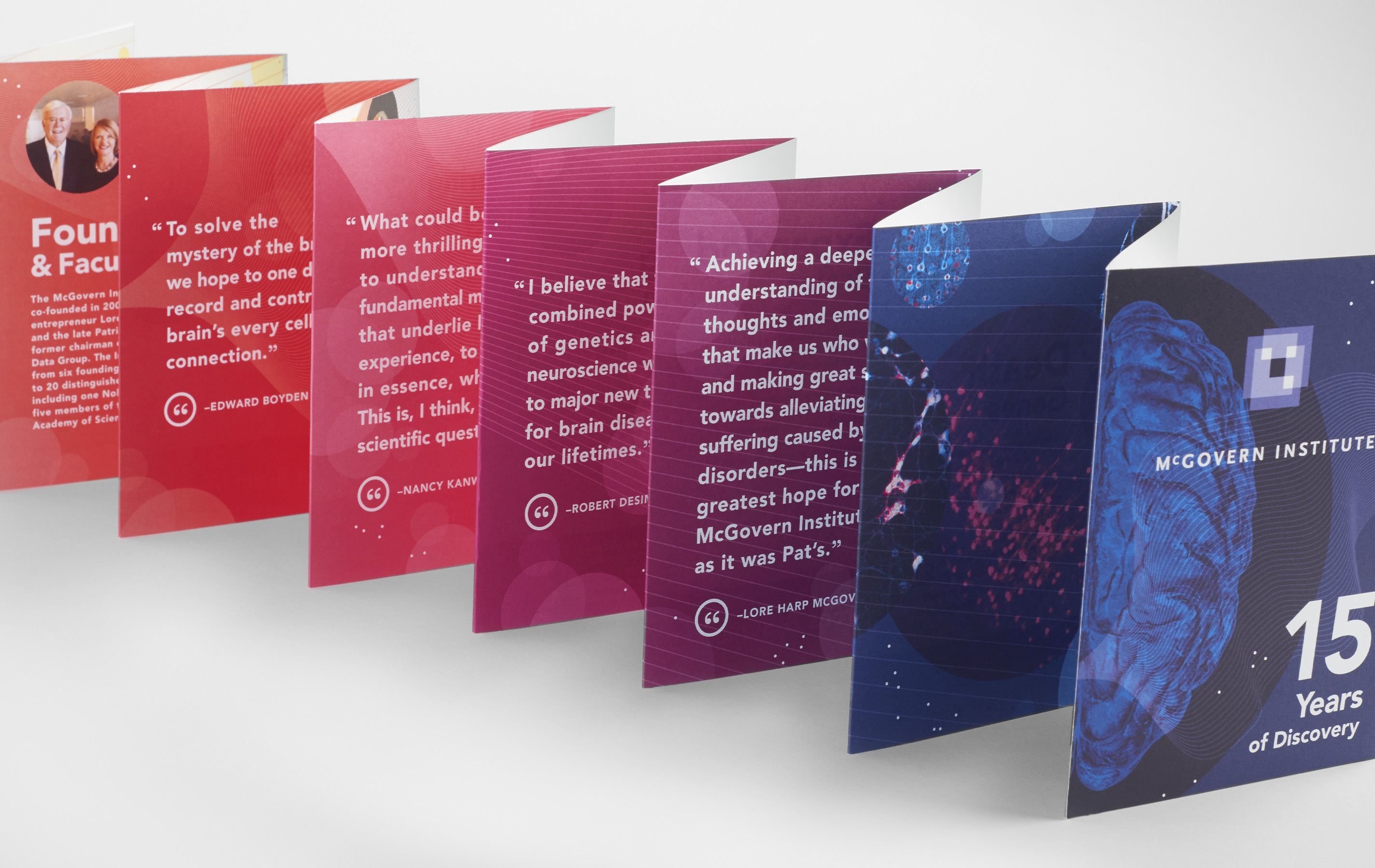
The McGovern Institute for Brain Research is a community of MIT neuroscientists committed to understanding the brain and to applying this knowledge to improve human health and well-being. For the occasion of its 15th anniversary, an ambitious booklet was created to give current and potential supporters a real sense of the progress that has been made—as well all the progress that is yet to be made.
Instead of creating a standard chronological timeline listing facts, a storyline was created based on discoveries of different size scales from small to large (Genes / Neurons&Synapses / Neural Circuits / Whole Brain Imaging). Four discoveries were identified in each of these four categories.
An accordion book that opens to 63” wide was chosen as as effective format to illustrate the forward momentum of these 12 discoveries, giving equal weight to each. A series of lines moving from left to right contribute to the forward trajectory. This book can be easily folded into a small 4.5” x 6” book that it can be carried or put in the post.
Ensuring that the focus is never inward, the context of the larger field of neuroscience is also included. A coloured ribbon running along the bottom compares where neuroscience research is today, compared where it was 15 years ago.
The overall messaging does not require a lot of time or study to understand. Care is always taken to not only highlight the “what,” but also the “why.”Posted in: MandR work flashback friday -
A typeface everyone should know → Ed Interlock
2 October 2023 
The Ed Interlock font uses “Artificial Ed-telligence to arrange letter combos for a more hand-done appearance!” exclaims its creators, House Industries.
What is AI up to now you might ask? “Disrupting the type industry,” perhaps? Here is the problem: handwritten digital fonts don’t really look convincingly like actual handwriting. There are many reasons for this, but one reason is that font software simply cannot make design decisions the way a professional letterer can. It cannot ensure that each individual letter in a word works beautifully with the others, in an overall balanced way.
Enter Ed Interlock. This is best explained using the visual below.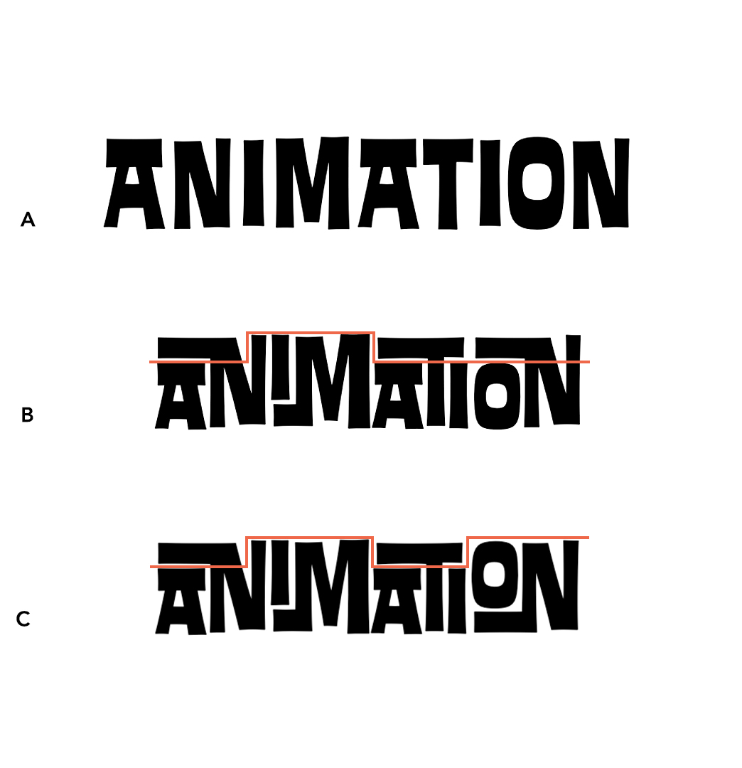
A. Letters do not overlap. Each letter of the typeface is sitting next to each other. If you squint your eyes, you can see that A has a lot of awkward empty 'white space' around the letters compared to the B and C. This looks like something done by a computer.
B. Letters overlap depending on the letter sitting to either side. Here we have the AN, IM, ATI and ON overlapping so that these pairs of letters fit nicely together with no awkward white space. These overlapping letters are called “ligatures.”
C. Letters overlap depending on the letter sitting to either side AND on the letters found in the entire word. This is an example of the font technology at work. The software can detect that B is off-balance: three of the ligatures are low and only one is high. To fix this, it automatically sets the last ligature high (the letter pair “ON”). Now we have four ligatures that are balanced: low, high, low and high.
In C, the word looks much more like something a design professional would create, rather than a computer. The font technology, called Open Source, is not actually new, but it is being used in a new way. Open Source allows for contextually-sensitive languages to be typed on a computer. These include Arabic and Sanskrit, where a letter shape depends on where, and in what order, it appears within a word or string of words.
If you would like to work with this typeface with one of your projects, please do get in touch! Of course, we work with many many other typefaces as well, and can help you find the one that best fits your particular project.Posted in: typography