Search
When?
-
One of the oldest printing press fonts: Garamond
12 August 2022 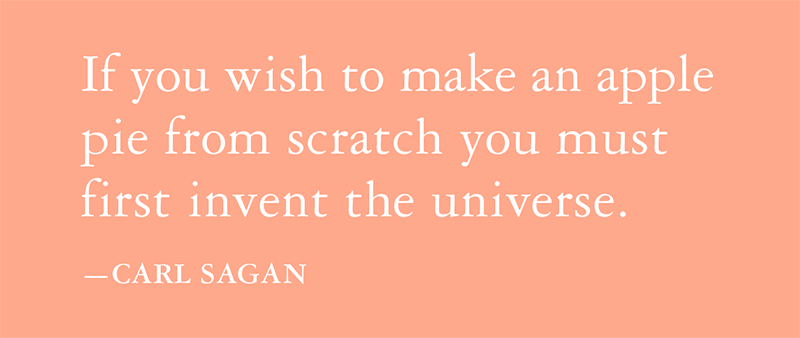
1470: the very first book was printed in Paris, France and a boom in typeface creation followed shortly after. It was here that Claude Garamond’s career as an engraver flourished, and his Garamond typefaces were created. Like many engravers, they were often commissioned for a single printer's exclusive use. Over time, they were sold or traded between printers.
Having designed many typefaces in his lifetime, it can be said that the origin of Garamond is not one typeface in particular, but rather his particular style, which was considered very contemporary and modern. Of course, Garamond has been modified and refined over the years, but this family of typefaces can still be said to be based upon Claude Garamond’s original designs from over 500 years ago.
Garamond is one of the oldest printing press fonts. It has survived the centuries because of its remarkable readability and timeless elegance. An exceptionally popular typeface in print today, it is found in some of the best-selling titles available from bookstores, including every book in the Harry Potter series. From 1983 to 2001 Apple used Garamond as their corporate font, but later moved to a modern font that had been drawn with the limitations of early computer screens in mind. Since it is so popular, at MOTHandRUST we prefer to use alternatives, such as Sabon or Caslon.
Of course an academic journal wouldn’t reject a manuscript on the basis of typeface alone, but this Nature article suggests that for manuscript submission, Garamond or Times New Roman are favoured. And it is interesting to note that Calibri is not!Posted in: typography design -
The ultimate breakdown of file formats
23 April 2021 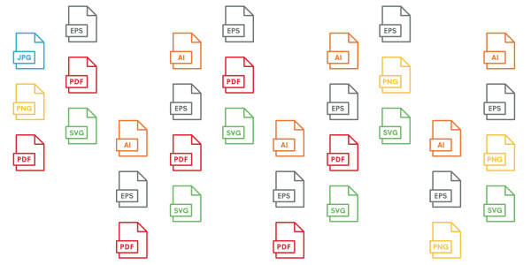
Project assets and other visuals are saved out in many different file formats. Understanding these enables our clients correctly save, send, and manage files, but this is not always easy!
Therefore, we have prepared the PDF (= universal file format) below that clearly sums everything up at-a-glance. We have been told that this is a useful reference...
It is always also really useful to understand that all file types can be classified one of two ways:
1. Raster
Raster images are made up of pixels, or little squares of colour. The pixels have a defined size depending on the resolution/quality of your image: high resolution has more pixels than low resolution. It is impossible to resize raster images without compromising their resolution/quality if you are moving from a smaller to a larger file.
2. Vector
Vector images resolve this resizing issue. They are constructed with proportional formulas instead of pixels. A vector image can be made as large as you like without looking pixelated and without compromising the resolution/quality.
https://www.mothandrust.co.uk/files/File-Formats-At-A-Glance.pdf
Et voila!
Posted in: design -
Suzan, why did you get a neuroscience degree? WHY?
25 September 2020  As someone who runs a design studio, it is not uncommon to hold a design degree. However, I do have a neuroscience degree as well, and when people find this out, they always ask, “why?”The answer is simple: I planned to be a psychiatrist.So what happened? It was a really tough decision that weighed on me a lot, but finally I decided to apply to art school instead of med school. Then at least I'd never wonder "what if..." And if I really wasn't happy, I could always go back and apply to med school later.I never looked back. And I learned an approach to tough decisions: go for it and if it doesn’t work out, you can usually go back to where you were before. It was this thinking that helped make moving to NYC, Montreal, San Francisco and finally London, for work after graduation, a bit easier.I often give this advice to students, who may answer: is it not a big waste of time and money? It seems that so many want to know exactly where they are going, and then simply get there in a nice, efficient straight line. I'm not sure this is always possible, or even desirable. It is however, understandable. Uni is so costly these days. A tuition freeze and some scholarships meant my student debt was manageable, so I was lucky—the cost was well worth it.If for whatever reason, your path leads in many directions, in this new world of disruption and convergence, it does not mean a big waste of time or money. A diverse background always feeds into what you do later on. In my case, my design studio MOTHandRUST works with a lot of science clients, which means my background is an advantage. I lead science-related projects that I am genuinely interested and passionate about. It makes it easier for me to convey scientific ideas and findings in compelling ways. I can quickly understand and grasp the needs and vision of my science clients. I understand a range of audiences both inside and out of the organisation. Finally, I see the similarities between the Art and Science, not just the differences.
 -
10 Virtual Event Engagement Ideas
11 September 2020 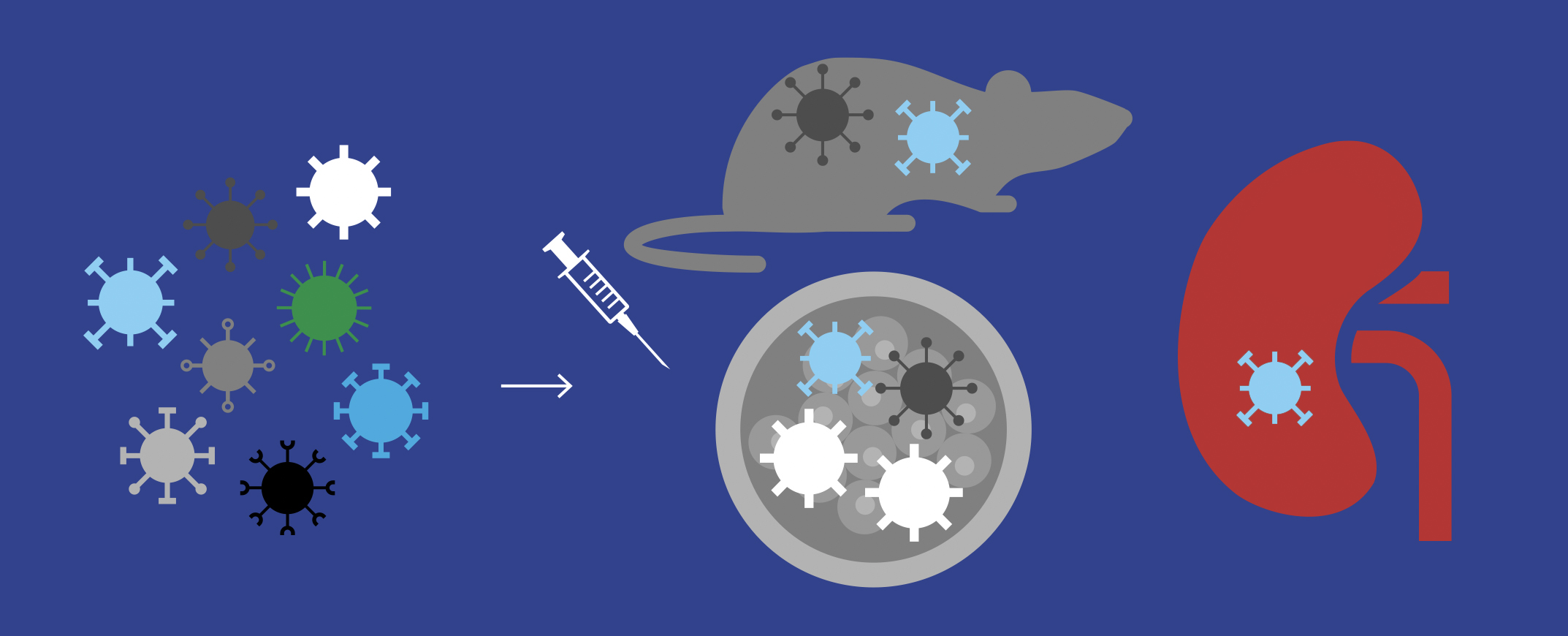 In the past few months, we have had quite a few requests for virtual event ideas, which has been great - there is so much that can be done! Below are just some possibilities... We use the word “event,” but this could be any online gathering from a more intimate one-on-one talk to a very large group conference.
1. Dedicated event website
- These may be simple or very complex, but they should always be beautifully designed, ultimately stirring interest in the upcoming event. Note that these can also serve many functions after the event as well.
- Content can include detailed bios about the speakers, information/background about the subject of the event, including links to articles, or e-book downloads.
- The schedule/programme for the event can also be included here (which can be constantly updated as speakers confirm, etc).
- Of course this can be open to all, or password-protected, so that only certain people have site access.
2. RSVP Invitations
- Taking full advantage of a digital format, animations and/or video may be included. For example, could the e-invite include a short video from a key speaker?
- Now more than ever, printed invitations can really stand out, and yes, they work great for virtual events!
3. Event agenda/programme
- A beautifully designed event agenda/programme with times allotted for each segment of the video event can be sent directly to your audience ahead of time.
- Again, if time allows, a printed version can be very effective.
4. In lieu of the restaurant event
- If there is a particular restaurant you usually meet at, perhaps the restaurant gift card could be included with the print invitation? Bonus benefit: this gift will allow you to support the restaurant industry, which has had an especially difficult time dealing with the effects of the pandemic.
5. Virtual wine and cheese
- It’s okay to have fun and try something more unexpected...
- Though you may not be able to not invite someone to an actual wine and cheese event, why not still supply the wine? Along with a printed invitation, perhaps a bottle of wine could be delivered with a custom additional label or in a custom box?
6. eBooks
- Perhaps you could give your recipients a beautifully-designed in-depth eBook that will educate them on a specific topic of an event?
- This e-book could also be downloaded via the dedicated event website, or via the e-invitation.
7. Session visuals
- Creative PowerPoint visuals, PDF slides or interactive animations could be created to accompany and add life to a talk.
- Real-time illustrators, provide an on-the-spot graphical representation of the event in a way that is fun to look at and, eg: https://liveillustration.co.uk
- The session visuals could be sent to the recipients as-is, or they could be deconstructed and pieces could be used with other photographs, etc to create a diverse artwork of the event.
- The image above is a still from an animation we created, for privacy reasons we cannot post this on our site, please contact us and we would be happy to share via email.
8. Recording as a memento
- One of the advantages of a virtual event is that it can be quite easily recorded.
- After the virtual event has concluded, use the recording as a memento and include it on the event site, or in a follow-up thank you email.
9. Pre-recordings
- Just because a virtual event is live does not mean there is no place for pre-recorded sessions as well. These can really enhance the live event. What these lack in real-time engagement, they make up for in production value, as they benefit from the ability to be edited.
10. Event memento
- Imagery from the event (real time illustrations, session visuals, portraits of those involved, etc) can all be made into an artwork that could be sent digitally, or it could be printed and mailed.
Of course if this is something you would like to speak to us about, please do!
-
Milton Glaser, 1929-2020
1 July 2020 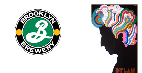
Tributes have poured in for Milton Glaser, who has died in New York on his 91st birthday, Friday June 26th, 2020. Says British graphic designer Jonathan Barnbrook on Facebook:
"One of the most influential designers in the history of design. I can't think of a designer who will be more missed by our community."
For those who are not familiar with Milton Glaser, I’ve gathered some facts and put them into a timeline:
June 26, 1929: Milton Glaser is born in the Bronx, to Eugene and Eleanor (Bergman) Glaser, immigrants from Hungary. His father owned a dry-cleaning and tailoring shop; his mother was a homemaker.
Late 1940s: After high school, while working at a package-design company, Glaser tried to get into Pratt Institute. After failing entrance exam twice, he finally applied to the Cooper Union for the Advancement of Science and Art and was accepted, so studied there instead.
1954: Glaser set up Push Pin Studios with three Cooper Union classmates. He remained at this successful studio for over 20 years.
1957: He married Shirley Girton, his replacement at the package-design company that first hired him. They remained married until his death, over 60 years later.
1967: One of his most famous works is created, a Bob Dylan poster, inserted in Dylan’s Greatest Hits album (see above).
1968: Glaser and editor Clay Felker found New York magazine, where he was president and design director until 1977. The visual format that still largely survives to this day.
1974: Glaser started his own design firm, Milton Glaser Inc. He remained working here regularly and productively up until his death.
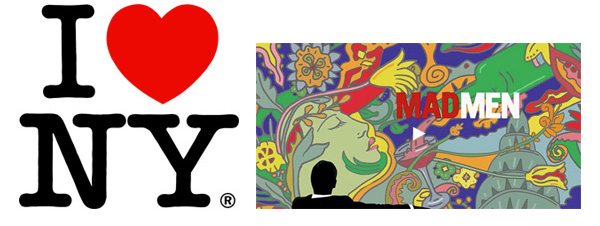
1977: Probably his most famous work was created, the “I ♥ NY” logo, part of a campaign to promote tourism in New York State.
1983: He teamed up with Walter Bernard to launch WBMG, a publication design firm that created more than 50 magazines, newspapers and periodicals globally.
Late 80s: The logo and packaging for Brooklyn Brewery is created, still in existence today.
2004: He received a lifetime achievement award from the Cooper-Hewitt National Design Museum (now the Cooper Hewitt, Smithsonian Design Museum).
2009: He became the first graphic designer to receive the National Medal of Arts.
2014: Designed the prolific poster for the final season of the television series “Mad Men.”
He taught graphic design at the School of Visual Arts for over 60 years.
He has never used a computer (though his designers do).
A quote from one of his last interviews, a few weeks before his death:
“I’m trying to acquire a new studio next door to a new apartment we bought. So that is the height of optimism, to buy a new apartment at the age of 90.”
Some of my favourite quotes:
"There is nothing more pleasurable to me than drawing and discovering I could do things I didn't know I was capable of."
"I don't think of my work as a series of pieces. Instead, I always think of what I learned from doing the piece and where it has led me."
"As I often quote Picasso, 'once you've mastered something, you can abandon it.'"
Posted in: design