Search
When?
-
What is the logo design process exactly?
6 December 2022 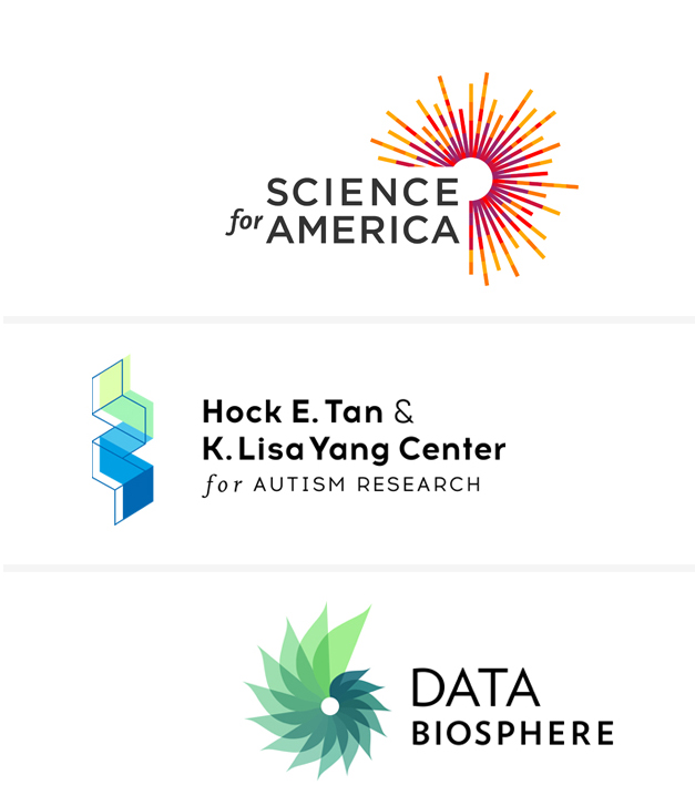
This is a good question, and one our clients would often like to know. We always emphasise the importance of investing as much as you can in a logo for your institute or organisation. A good logo should serve you well over time. Often a lot of time. As the backbone of your brand, updating it can be more work than you think, as anything with your old logo would need to be changed as well.
I’d like to note that this process is not exactly the same for all designers, and what is outlined below is not comprehensive. Of course I am happy to chat about this further (and I often do!)
Research + Strategy
The design of the logo is always part of a wider brand strategy. The depth required varies tremendously. It can require days, months, or sometimes even years. The appropriate scope of work depends on the individual project.
Starting with a set of questions, we discuss (and sometimes debate!) an organisation's essence: who it is, what it does and what it will deliver. We also examine such things as the target market and competitors. Once complete, our clients often comment on how valuable this clarity and insight is—despite how much they thought they understood their brand previously.
Concepting + Design
As a designer trying to put words to this phase, I realise how fascinating it is! And challenging. Clients can be surprised at how long this phase can take.
Inspiration can come from anywhere. Often visuals are sketched or found online. They are pieced together, taken apart, elaborated on, grouped, left for a few days, brainstormed, and worked on again and again to form logo concepts. The best concepts are grouped into design directions and developed further. Some clients think that the first design round is simply a presentation of all the work done to date, but this is not the case! We only present the most successful design directions.
Crucially, this phase is also very much guided by the Brief + Strategy phase listed above.
There are usually at least four design rounds, more depending on the project scope. So that they can be prepared, we always tell our clients that one of the biggest delays is the amount of time it takes to get feedback after each round.
Files + Guidelines
The final logo is delivered in various file formats and sizes. If you require any additional file format in the future, we are happy to provide this free of charge.
A brand guidelines document is provided that sums up the brand work. This helps anyone using the logo, or any other brand elements, to prepare high impact materials that are consistent, whether it is a PowerPoint document or an email newsletter. The brand guidelines can be anywhere from one page to dozens, depending once again on the project scope.
Above are examples of a few of the logos we have designed recently for various scientific organisations. -
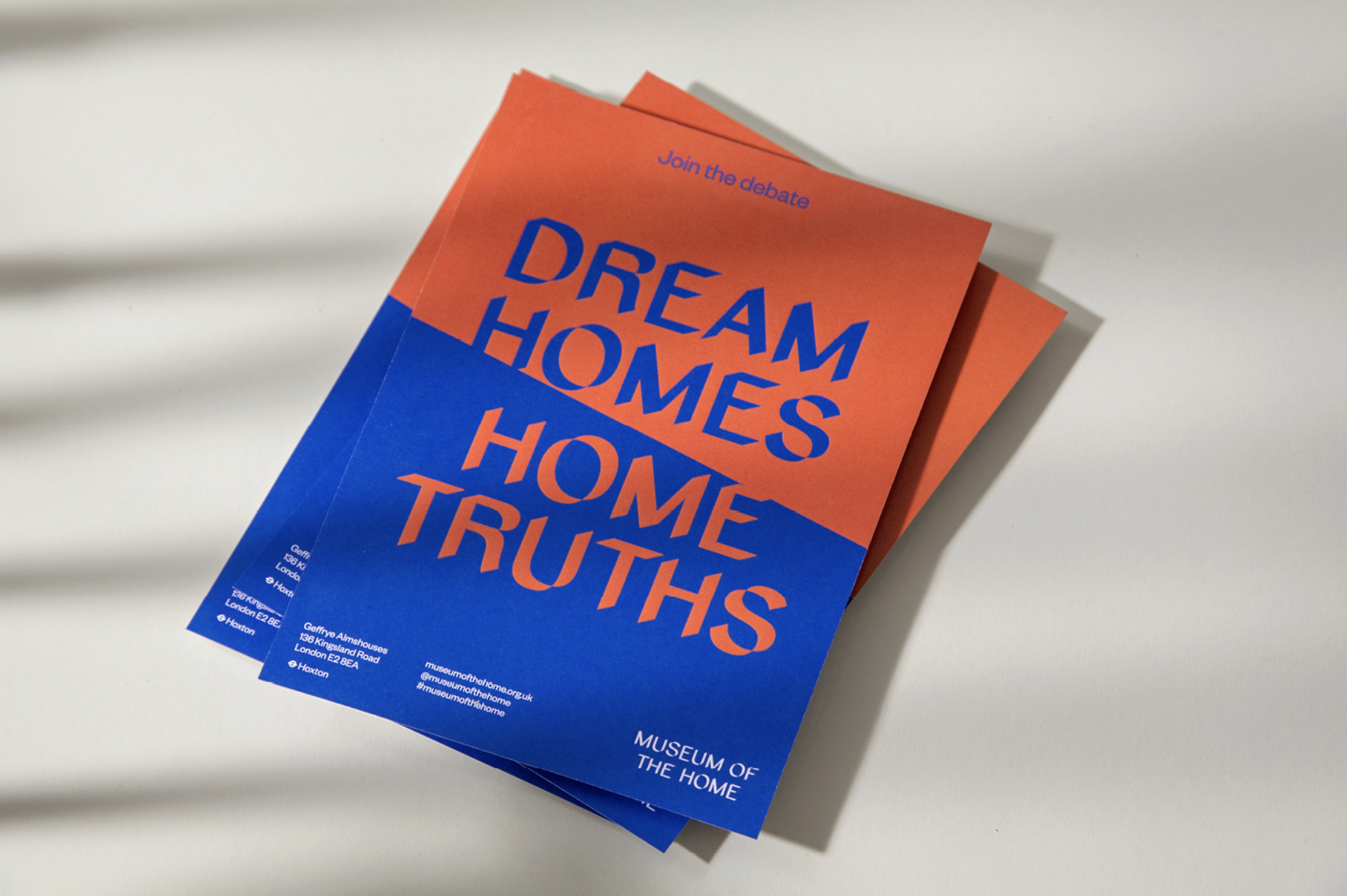
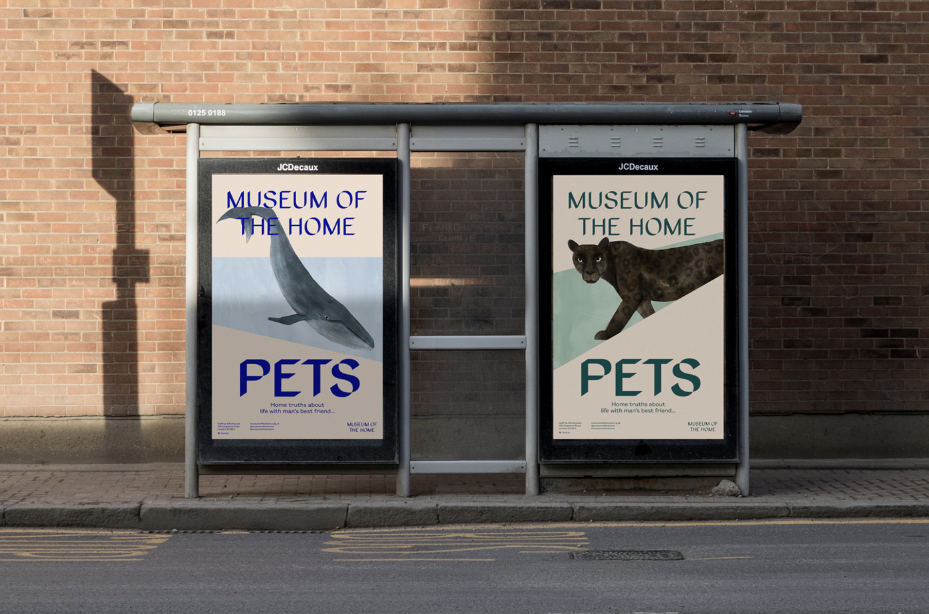
Geffrye Museum of the Home REBRAND
31 January 2020 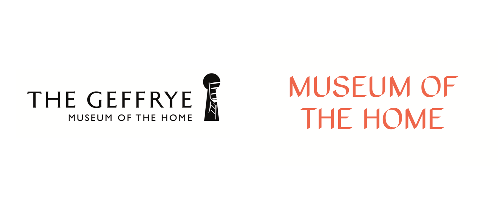
Hi MLE,
Of course, the old logo was looking a dated, but at least it had an idea. "Shadows," as found in the shadowed type, is not only something we have all seen before, but it's not really an interesting idea, at least not in the way it executed here.In application, the tone of voice is not clear. In the blue and orange cards, it's a bit edgy, jarring and somehow aggressive. In the more muted colours of the bus shelter ads, it's more approachable and subdued, like a different person.
Sadly, this is actually quite prominent museum here in East London, I do think it deserved better.
Or maybe I'm being too harsh? Maybe next time we talk, it will have grown on me. Or maybe not. Let's see... :)
More info here at Under Consideration
SuzanPosted in: identities -
NEW sears logo
25 May 2019 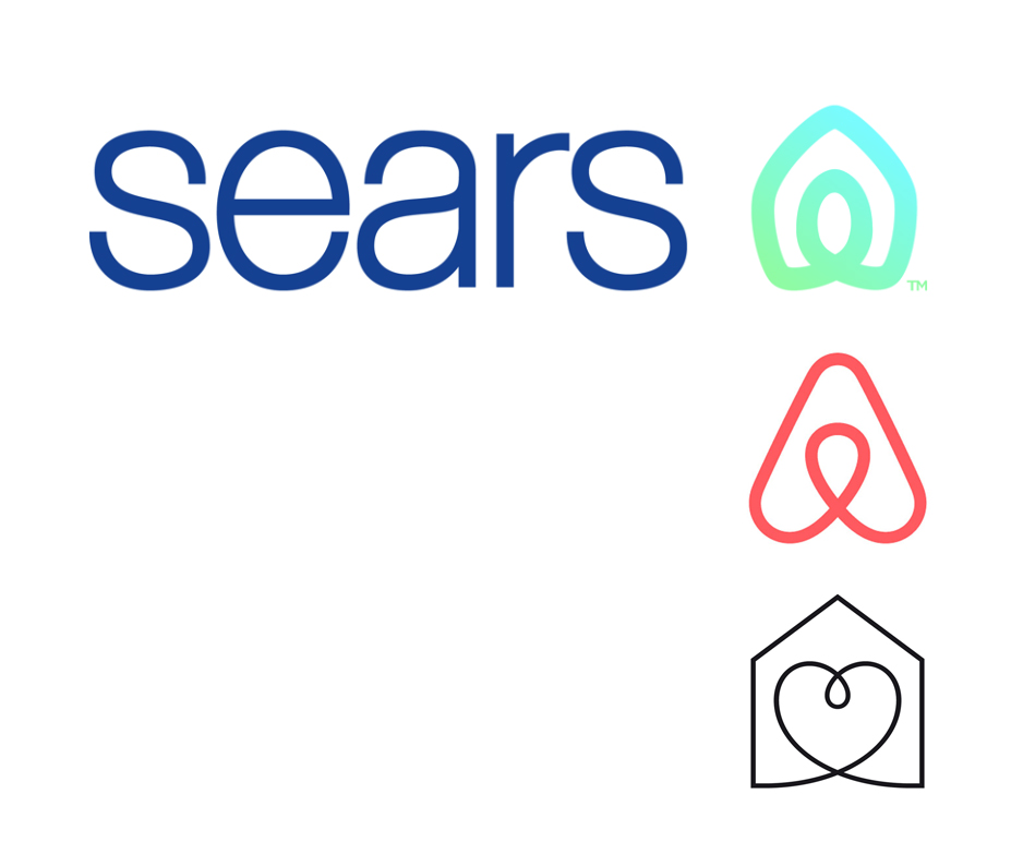
Hello MLE,
As you may know, Sears announced a new logo on May 1st. Are they still in business? Well yes, their Canadian stores closed a few years ago, but about 400 of their American ones will remain open following a narrow escape from bankruptcy. Of course it's a bit of a "no-brainer" that the new logo looks like the AirBNB logo (middle icon above). However, having just read the rationale behind the Sears logo, and it seems that this rationale has been copied from the Habitat logo (bottom icon above), yet not executed as well:
The new icon was created to represent both home and heart, this shape also conveys motion through an infinity loop, reminiscent of one getting their arms around both home and life.
Well, at least not many Americans are familiar with Habitat. I wonder if this new logo is a sign things to come for Sears...
Suzan
Posted in: identities branding -
Classic Logos: CBS (1951)
18 August 2017 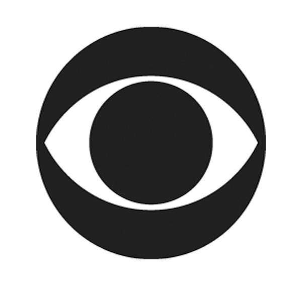
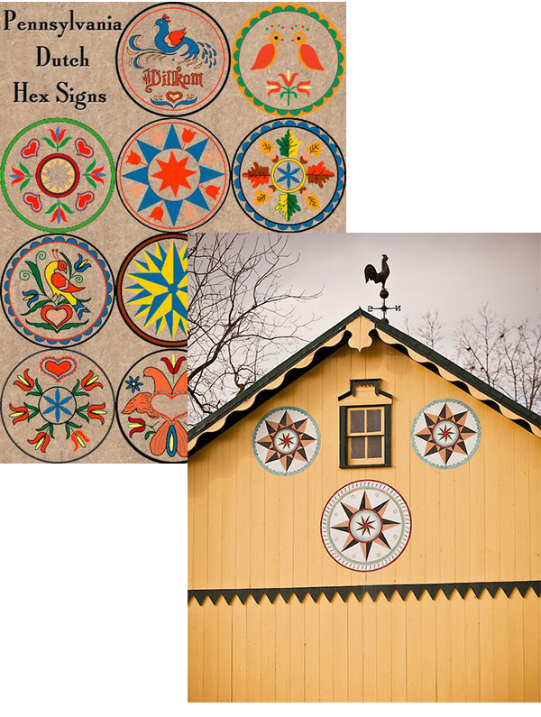 Hi MLE,This week our classic logo is the CBS logo. It has always seemed a bit ominous to me, and I was quite interested to hear its story…It is based on the ‘all-seeing eye’ Hex symbols painted on Shaker barns in Pennsylvania Dutch country. I have never heard of these symbols, but some of them are lovely and they look great on their amazing barns.The in-house CBS creative director of Advertising and Sales Promotion worked with a graphic designer using the Hex symbol as a starting point and created ‘the eye,’ as well as two other routes were presented - and the eye was a clear winner.On October 20, 1951, CBS Television unveiled its new logo in station breaks voiced by various celebs: “keep your eye on this eye.”
SuzanPosted in: identities -
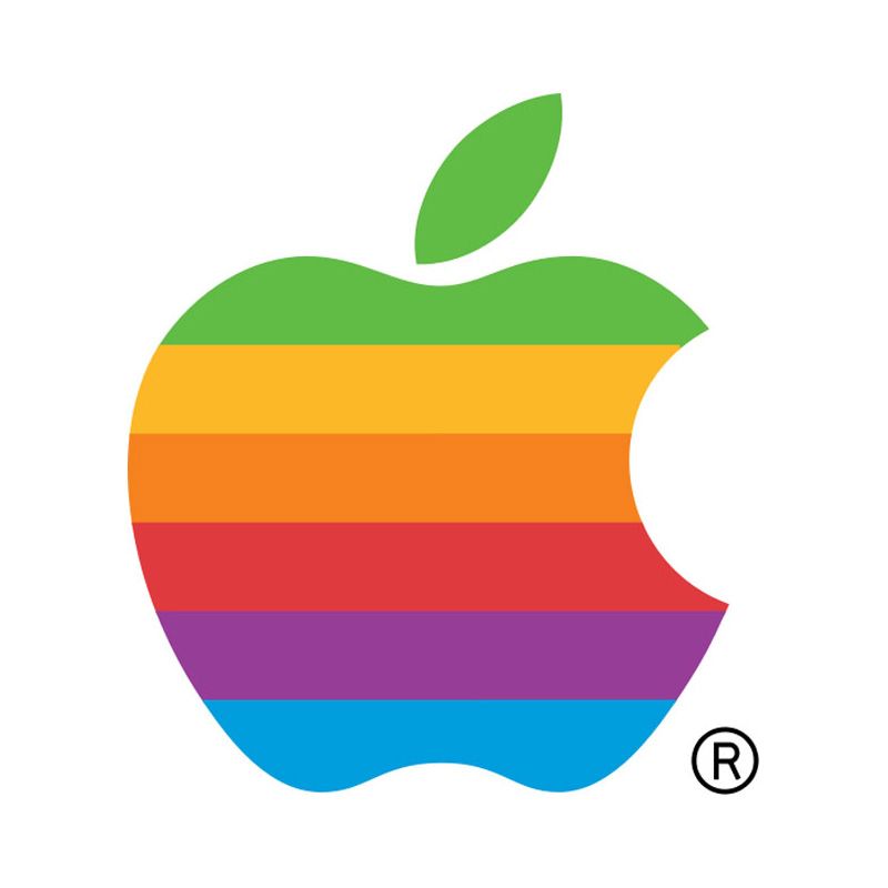
Classic Logos: Apple (1977)
14 July 2017 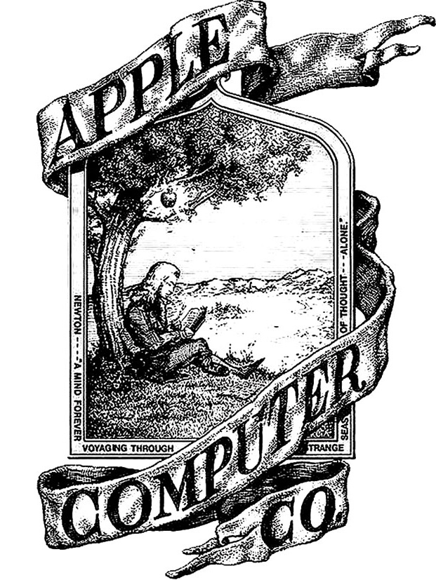
Hello the MLE,
Ah yes, the ubiquitous Apple logo. It’s always ranking up there with the classic logos of all time, but is this is because it’s really such a great logo, or because everyone loves the Apple brand so much? I really enjoy speaking with clients years after we’ve created a logo for them, I’m always surprised to learn how much emotion is attached to it.Yes, believe it or not, that is the original Apple logo at the top of the post. Designed in 1976, it is Isaac Newton sitting under an apple tree, of course.It’s interesting that Steve Jobs went to the effort and expense of engaging an ad agency, just one year later to create a more businesslike logo. Evidently the brief was just, “don’t make it cute.”A bite was taken from the apple so that it didn’t look like a cherry. The coloured stripes were a reminder that the Apple II had a colour monitor. This logo was used from 1977 to 1998. After that all Apple design was done in-house and the colours were removed so that the logo could appear very large and not be too obtrusive.
SuzanPosted in: identities