Search
When?
-
A typeface everyone should know → Ed Interlock
2 October 2023 
The Ed Interlock font uses “Artificial Ed-telligence to arrange letter combos for a more hand-done appearance!” exclaims its creators, House Industries.
What is AI up to now you might ask? “Disrupting the type industry,” perhaps? Here is the problem: handwritten digital fonts don’t really look convincingly like actual handwriting. There are many reasons for this, but one reason is that font software simply cannot make design decisions the way a professional letterer can. It cannot ensure that each individual letter in a word works beautifully with the others, in an overall balanced way.
Enter Ed Interlock. This is best explained using the visual below.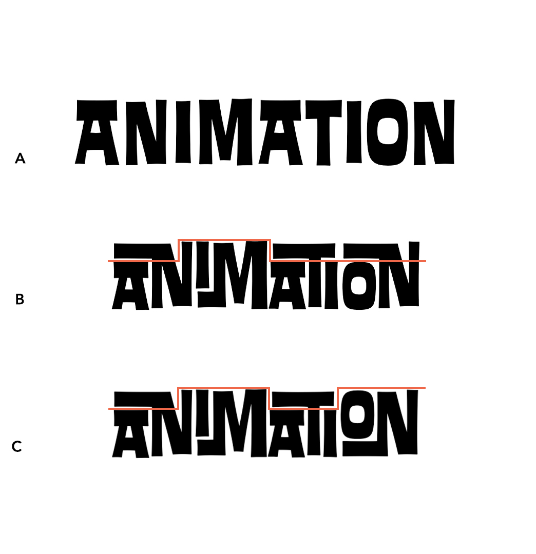
A. Letters do not overlap. Each letter of the typeface is sitting next to each other. If you squint your eyes, you can see that A has a lot of awkward empty 'white space' around the letters compared to the B and C. This looks like something done by a computer.
B. Letters overlap depending on the letter sitting to either side. Here we have the AN, IM, ATI and ON overlapping so that these pairs of letters fit nicely together with no awkward white space. These overlapping letters are called “ligatures.”
C. Letters overlap depending on the letter sitting to either side AND on the letters found in the entire word. This is an example of the font technology at work. The software can detect that B is off-balance: three of the ligatures are low and only one is high. To fix this, it automatically sets the last ligature high (the letter pair “ON”). Now we have four ligatures that are balanced: low, high, low and high.
In C, the word looks much more like something a design professional would create, rather than a computer. The font technology, called Open Source, is not actually new, but it is being used in a new way. Open Source allows for contextually-sensitive languages to be typed on a computer. These include Arabic and Sanskrit, where a letter shape depends on where, and in what order, it appears within a word or string of words.
If you would like to work with this typeface with one of your projects, please do get in touch! Of course, we work with many many other typefaces as well, and can help you find the one that best fits your particular project.Posted in: typography -
Five ways of looking at Comic Sans
3 March 2023 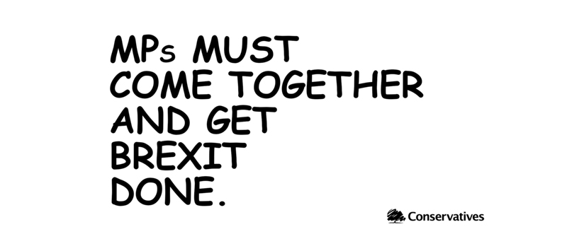
Having gotten to know more about this typeface, I actually appreciate it a bit more—just for what it is!
1)When Microsoft designer Vincent Connare saw a beta version of the cartoon Microsoft Bob that used Times New Roman in the word balloons, he thought: "Comic dogs don't talk in Times New Roman.” In 1994 he created Comic Sans, but unfortunately this was too late for his typeface to ever be used in the Microsoft Bob cartoons.
2)The comic book type of Dave Gibbons was one of the inspirations for Comic Sans. Gibbons has said that it was "a shame they couldn't have used just [my] original font, because [Comic Sans] is a real mess. I think it's a particularly ugly letter form."
3)In 2012, a Dutch World War II memorial called "Reconciliation" was revealed, on which the names of Jewish, Allied and German military deaths were written in Comic Sans. This caused an uproar as the font was deemed inappropriate. Comic Sans’ consistent use over the past thirty years in contexts that it wasn't intended for is one reason why it is thought to be so despised.
4)As part of the United Kingdom's Brexit debate, the Conservative Party tweeted an image stating "MPs must come together and get Brexit done" using Comic Sans. The tweet was heavily ridiculed—but some commentators saw it as a deliberate attempt to use the typeface's notoriety in order to bring their message to a wider audience.
5)These days Connare lives in the French countryside, where he grows olive trees and practices calligraphy in his spare time. He is not overly concerned about people's opinions of him, or his typeface. "Most people are friendly and nice about it," Connare says. "It's like it's a song that they don't want anybody to know that they like." Perhaps Comic Sans has a secret following?Posted in: typography -
One of the oldest printing press fonts: Garamond
12 August 2022 
1470: the very first book was printed in Paris, France and a boom in typeface creation followed shortly after. It was here that Claude Garamond’s career as an engraver flourished, and his Garamond typefaces were created. Like many engravers, they were often commissioned for a single printer's exclusive use. Over time, they were sold or traded between printers.
Having designed many typefaces in his lifetime, it can be said that the origin of Garamond is not one typeface in particular, but rather his particular style, which was considered very contemporary and modern. Of course, Garamond has been modified and refined over the years, but this family of typefaces can still be said to be based upon Claude Garamond’s original designs from over 500 years ago.
Garamond is one of the oldest printing press fonts. It has survived the centuries because of its remarkable readability and timeless elegance. An exceptionally popular typeface in print today, it is found in some of the best-selling titles available from bookstores, including every book in the Harry Potter series. From 1983 to 2001 Apple used Garamond as their corporate font, but later moved to a modern font that had been drawn with the limitations of early computer screens in mind. Since it is so popular, at MOTHandRUST we prefer to use alternatives, such as Sabon or Caslon.
Of course an academic journal wouldn’t reject a manuscript on the basis of typeface alone, but this Nature article suggests that for manuscript submission, Garamond or Times New Roman are favoured. And it is interesting to note that Calibri is not!Posted in: typography design -
THE 27th LETTER of the alphabet: &
6 April 2022 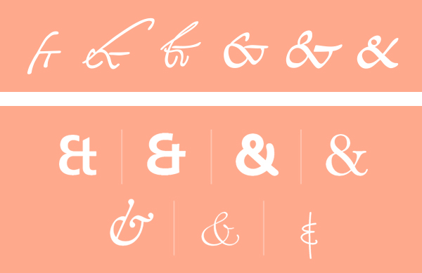
The ampersand is a written character that represents a word, or a "logogram." You may notice that it sometimes looks like an "e" and a "t," in some instances. Well that's because it is! It originated as a ligature of the letters "et," Latin for "and." (As a French speaker, I see the French word "et," which means "and.")
The Romans first drew this ligature, most likely sometime before 79 CE. The image directly above shows how the ampersand has evolved from 131 to 810 CE. Since the ampersand's roots go back to Roman times, many languages that use a variation of the Latin alphabet make use of it as a stand-in for the word "and."
For centuries it was regarded as the 27th letter of the English alphabet, which helped it get its own name. Traditionally, when reciting the alphabet in English-speaking schools, any letter that could also be used as a word in itself was repeated with the Latin expression "per se" ("by itself.") Eg: "A per se A."
The recitation of the alphabet would always end in X, Y, Z, "& per se &". This phrase was routinely slurred to "ampersand." By 1837 the term had entered common English.
French “esperluette” may have a similar origin, “et per lui et”. The German name, in typical straightforward German fashion, is simply “Et-Zeichen” (“et symbol”).
Type designers often put a lot of work into the ampersand and designers usually love to use them. So much can be done! For example, an ampersand in one typeface, can often look great set alongside another, completely different typeface. To note, typographic guidance says to only use ampersands in headers or logos. In body copy ampersands tend to stand out too much, disrupting the flow of the eye across a page.
Posted in: typography -
A typeface everyone should know (and probably does) → Helvetica
28 July 2021 
Developed in 1957 by Swiss typeface designer Max Miedinger with input from Eduard Hoffmann, this typeface, very quickly, became one of the most popular typefaces of the 20th century.Originally named Neue Haas Grotesk, it was changed to Helvetica which is "Swiss" in Latin. This capitalised on Switzerland's reputation as a centre of ultra-modern graphic design and helped to sell the typeface abroad.Helvetica provided something that designers wanted: a neutral typeface apparently devoid of personality, that had great clarity, and could be used on a wide variety of signage. Indeed it's featured on signage from the New York subway to previous South Korean and Japanese road signs.Helvetica has also been used for countless logos (please see the image above).Versions exist for Latin, Cyrillic, Hebrew, Greek, Japanese, Korean, Hindi, Urdu, Khmer, and Vietnamese alphabets. Chinese faces have been developed to complement Helvetica.Derivative designs based on Helvetica were rapidly developed, taking advantage of the lack of copyright protection in the phototypesetting font market of the 1960s onward. One could argue that such a trend has remained ongoing.As you may know from our previous newsletter, Arial was created for IBM to substitute for Helvetica—without IBM having to pay Linotype for a Helvetica license on its printers.IBM used Helvetica Neue as its corporate typeface until 2017. Like many big corporations, IBM now has its own bespoke typeface, saving over $1m annually on licensing fees.If you have a Mac, it probably came with Helvetica installed and licensed. This shot Helvetica into the hands of everyone, not only designers, helping to maintain its popularity and relevance over the decades.Here at MOTHandRUST, we don't tend to use Helvetica, as it is so overused—the American designer and design historian Paul Shaw puts it best: "Helvetica is an invasive and drug-resistant species that may never be eradicated. Even designers who don't often use it in their own work take pride in the fact that it is such a persistent cultural icon."Posted in: typography