Search
When?
-
The first Merkin Prize in Biomedical Technology has been awarded
8 November 2023 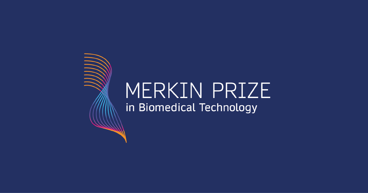
"It's a very high honor for me to have been selected for this prize. The research we're being recognized for, people worldwide in almost every biology and biochemistry laboratory use our chemistry in one way or another," said Dr. Caruthers.This autumn, Dr. Marvin H. Caruthers of the University of Colorado, Boulder, has won the inaugural Richard N. Merkin Prize in Biomedical Technology for developing an efficient, automated technology for synthesizing DNA. The ability to synthesize genetic information has ultimately changed the face of medicine and paved the way for the genetics revolution.The Merkin Prize, created by the Merkin Family Foundation and administered by the Broad Institute of MIT and Harvard, recognizes technologies that have improved human health, and carries a $400,000 cash award. Nominations from around the globe were evaluated by a selection committee composed of eight scientific leaders from academia and industry in the US and Europe, as well as jury chair Dr. Harold Varmus, Nobel laureate."Dr. Caruthers' work demonstrates the type of technology used in the life sciences that impacts patients' care and has significantly advanced healthcare for millions, the purpose of the prizes," said Dr. Richard Merkin, President and CEO of Heritage Provider Network, one of the country’s largest physician founded and physician owned integrated healthcare systems.The logo and branding for this prize was proudly developed by MOTHandRUST.Nominations for the 2024 Merkin Prize will open in September 2023. Visit merkinprize.org for more information.Posted in: science MandR work -
#FlashbackFriday: Communicating 15 years of science
20 October 2023 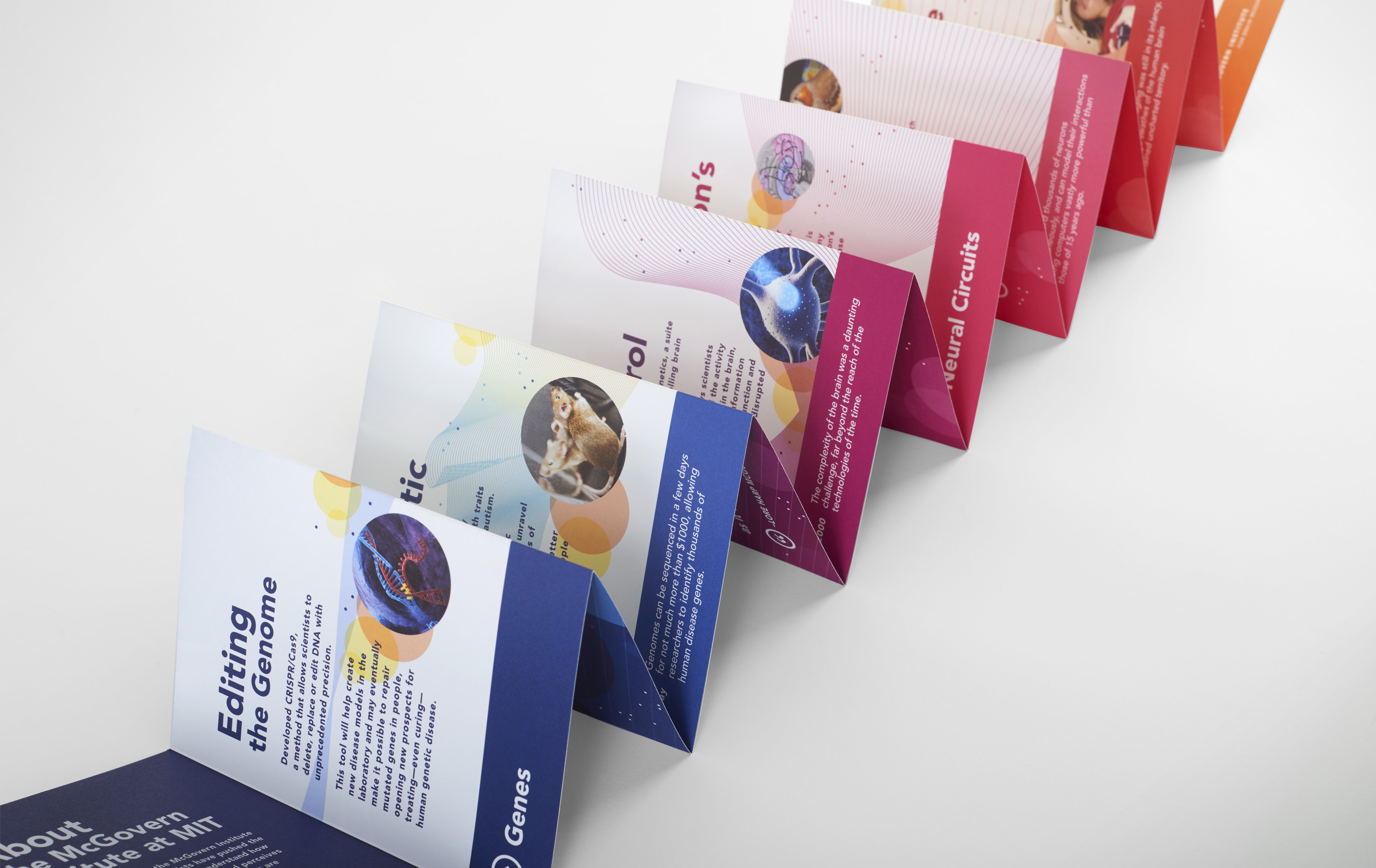
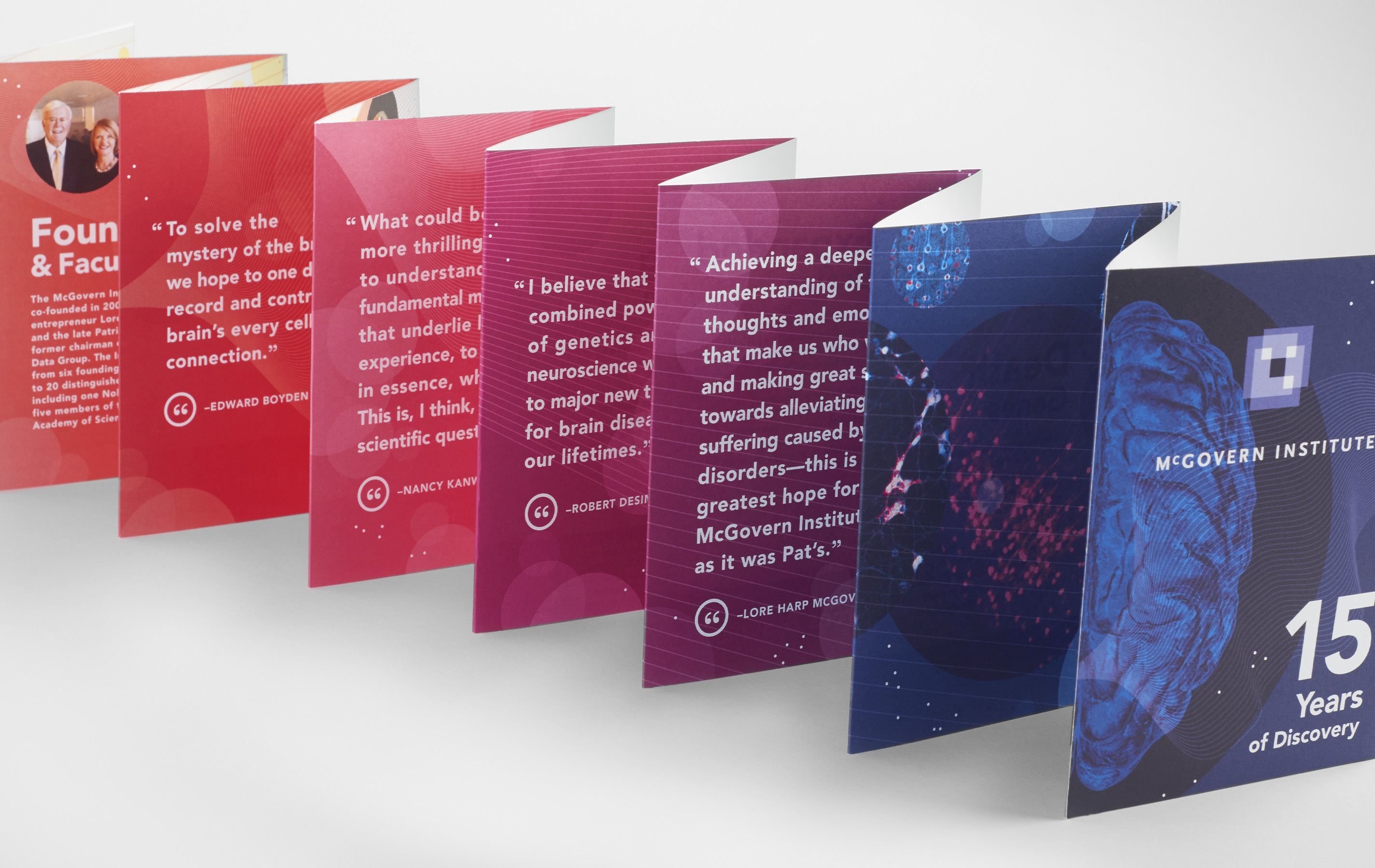
The McGovern Institute for Brain Research is a community of MIT neuroscientists committed to understanding the brain and to applying this knowledge to improve human health and well-being. For the occasion of its 15th anniversary, an ambitious booklet was created to give current and potential supporters a real sense of the progress that has been made—as well all the progress that is yet to be made.
Instead of creating a standard chronological timeline listing facts, a storyline was created based on discoveries of different size scales from small to large (Genes / Neurons&Synapses / Neural Circuits / Whole Brain Imaging). Four discoveries were identified in each of these four categories.
An accordion book that opens to 63” wide was chosen as as effective format to illustrate the forward momentum of these 12 discoveries, giving equal weight to each. A series of lines moving from left to right contribute to the forward trajectory. This book can be easily folded into a small 4.5” x 6” book that it can be carried or put in the post.
Ensuring that the focus is never inward, the context of the larger field of neuroscience is also included. A coloured ribbon running along the bottom compares where neuroscience research is today, compared where it was 15 years ago.
The overall messaging does not require a lot of time or study to understand. Care is always taken to not only highlight the “what,” but also the “why.”Posted in: MandR work flashback friday -
#FlashbackFriday: Wilton’s Music Hall Site
9 June 2023 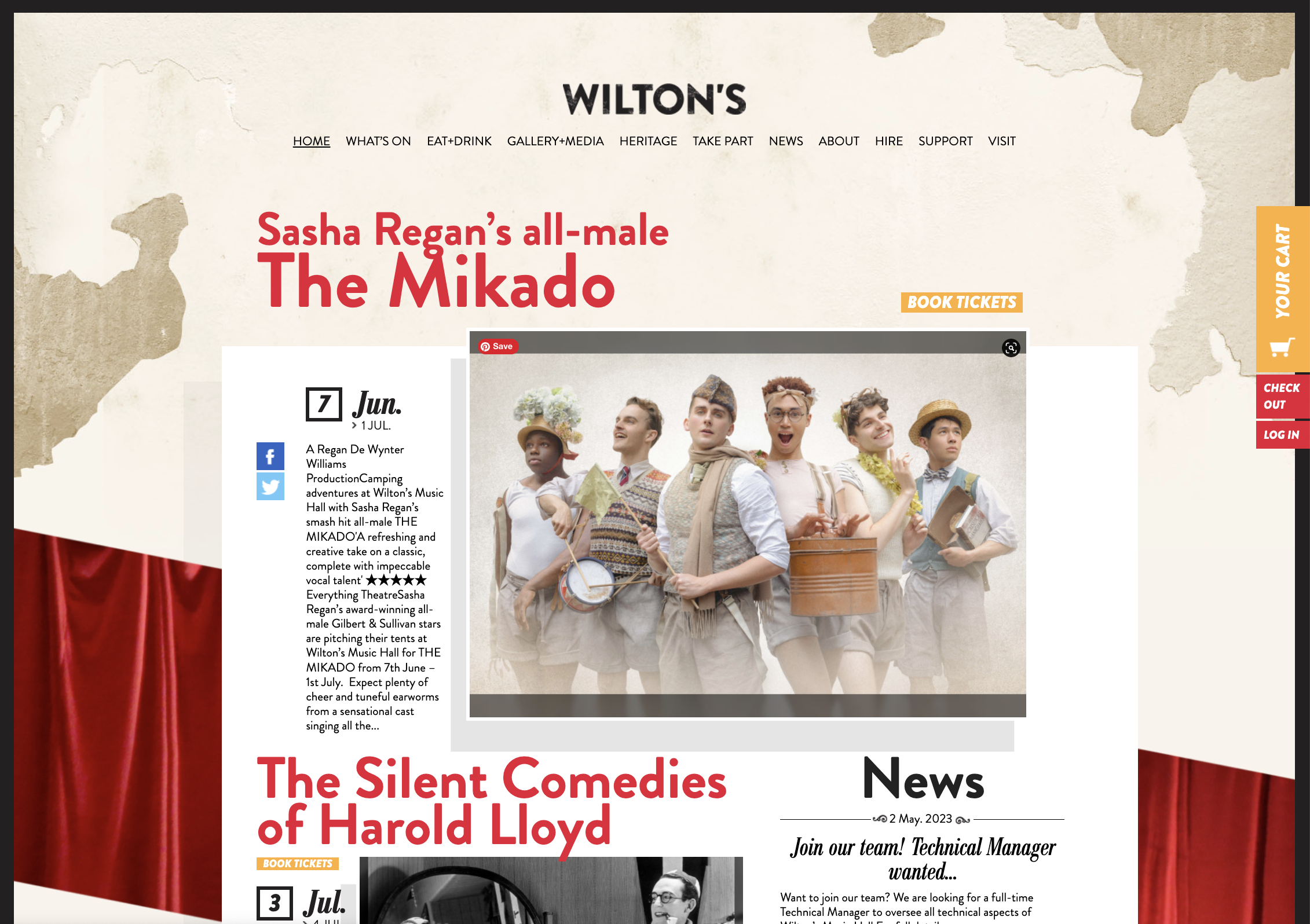
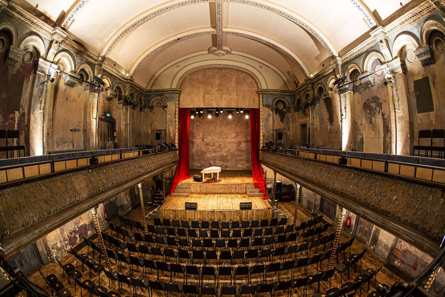
Wilton's is a very special and unique Grade II listed building here in East London. It is one of the few surviving music halls left in the world, with many beautiful original features—anyone who has been there will speak of its atmosphere. It is incredible that after 160 years, this music hall has somehow managed to survive.
In 1877, a fire ripped through the grand hall. In the 1960’s it was scheduled for demolition by the London City Council (LCC). It took four decades hard work and campaigning, but the building was ultimately saved. Today, it is a grand performance venue once again!
MOTHandRUST designed and built the Wilton’s Music Hall site about nine years ago now. Wilton’s is still very happy with it—which has proven great value for the non-profit. Here at MOTHandRUST we are proud that many of our robust sites have served a longer lifespan than average and that we have long-term relationships with many of our clients. However, one must remember that no matter how much you love your site, a redesign will be needed at some point.
I’ll be leaving work shortly to see Sasha Regan’s all-male the Mikado at Wilton’s, with a drink and pizza there beforehand. Really recommended to anyone here in London.
Posted in: MandR work -
Host an event and have your organisation shine
12 April 2023 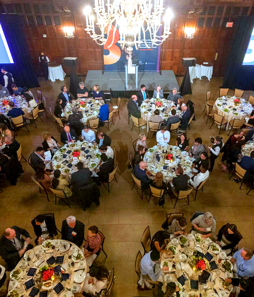
Sometimes, when so much energy is focused on the event, it can be easy to forget events are a great opportunity to showcase your organisation as well.
MOTHandRUST find these three questions are useful to ask of any event design project:
What event design work do you need exactly?
Of course this seems obvious. However, we are often surprised at how often this is not as thought through well as it could be! Consider all the places the event visuals may exist at the beginning of the project when everyone is still fresh: site, emails, signage, name tags, podium, social, registration page, program, invitations, PowerPoint presentations, to name a few. Of course, it is often not possible to know exactly what will be required and things change. However, your future-self will be thankful that a comprehensive—and editable—list was at least made.
Are your designs flexible?
Event visuals need to extend across a variety of media while still being having a consistent look-and-feel. It must also exist in many shapes and sizes. A flexible format is one that can be scaled up to a large size or down to a small size. A design that works well on an invitation may not always work well across the event as a whole, particularly if it relies on imagery that can not be increased in size or seen properly from a distance.
Are your designs on-brand?
Some think their event must strictly follow their branding—no exceptions. Others think their branding is not necessary at all. We usually suggest the answer lies somewhere in between. You are showcasing your organisation, and as such its brand should be easily recognisable. However, if you follow the brand very strictly, there is a risk that all events will end up looking the same. Some flexibility is often necessary. Use the brand as a base and expand it out, with the help of a designer or your design team.
The photo above is a recent event designed for the Smith Family Awards Program for Excellence in Biomedical Research.
Photo credit: Erik Jacobs, Anthem Multimedia
Posted in: MandR work events -
What is the logo design process exactly?
6 December 2022 
This is a good question, and one our clients would often like to know. We always emphasise the importance of investing as much as you can in a logo for your institute or organisation. A good logo should serve you well over time. Often a lot of time. As the backbone of your brand, updating it can be more work than you think, as anything with your old logo would need to be changed as well.
I’d like to note that this process is not exactly the same for all designers, and what is outlined below is not comprehensive. Of course I am happy to chat about this further (and I often do!)
Research + Strategy
The design of the logo is always part of a wider brand strategy. The depth required varies tremendously. It can require days, months, or sometimes even years. The appropriate scope of work depends on the individual project.
Starting with a set of questions, we discuss (and sometimes debate!) an organisation's essence: who it is, what it does and what it will deliver. We also examine such things as the target market and competitors. Once complete, our clients often comment on how valuable this clarity and insight is—despite how much they thought they understood their brand previously.
Concepting + Design
As a designer trying to put words to this phase, I realise how fascinating it is! And challenging. Clients can be surprised at how long this phase can take.
Inspiration can come from anywhere. Often visuals are sketched or found online. They are pieced together, taken apart, elaborated on, grouped, left for a few days, brainstormed, and worked on again and again to form logo concepts. The best concepts are grouped into design directions and developed further. Some clients think that the first design round is simply a presentation of all the work done to date, but this is not the case! We only present the most successful design directions.
Crucially, this phase is also very much guided by the Brief + Strategy phase listed above.
There are usually at least four design rounds, more depending on the project scope. So that they can be prepared, we always tell our clients that one of the biggest delays is the amount of time it takes to get feedback after each round.
Files + Guidelines
The final logo is delivered in various file formats and sizes. If you require any additional file format in the future, we are happy to provide this free of charge.
A brand guidelines document is provided that sums up the brand work. This helps anyone using the logo, or any other brand elements, to prepare high impact materials that are consistent, whether it is a PowerPoint document or an email newsletter. The brand guidelines can be anywhere from one page to dozens, depending once again on the project scope.
Above are examples of a few of the logos we have designed recently for various scientific organisations.